
The Effect of PCR on scRNAseq
In the Tabula Muris study, we performed single-cell RNA sequencing on tissues from multiple mice using two different technologies: microfluidic droplet-based 3’-end counting on the 10x genomics platform, and FACS-based full-length transcript analysis with Smart-Seq2. Both platforms have advantages: droplets let us easily profile thousands of cells while Smart-Seq2 recovers more genes per cell and provides full-length transcripts.
This provides us with an opportunity to compare the views of gene expression provided by these two technologies on cells from the same mice. For a comprehensive discussion of this topic, you can check out the paper. In this post we’ll try to get a quantitative understanding of the processes that generate single-cell sequencing data by comparing simulations to the experimental data.
import anndata as ad
import altair as alt

# increase row limit for altair
alt.data_transformers.enable("default", max_rows=None)

# render to png directly to save memory
alt.renderers.enable("png")

import numpy as np
import pandas as pd
import scipy.stats as st
# read in FACS data
facs_metadata = pd.read_csv("../../data/TM_facs_metadata.csv", index_col=0, dtype=str)
facs_data = ad.read_h5ad("../../data/TM_facs_mat.h5ad")

# read in droplet data
droplet_metadata = pd.read_csv("../../data/TM_droplet_metadata.csv", index_col=0, dtype=str)
droplet_data = ad.read_h5ad("../../data/TM_droplet_mat.h5ad")
Let’s start by looking at the cells from one organ sequenced on both platforms, and compare the gene levels we observe. For the rest of this post we’re going to look at the thymus.
# subset to thymus
facs_thymus = facs_data[facs_metadata["tissue"] == "Thymus", :]
droplet_thymus = droplet_data[droplet_metadata["tissue"] == "Thymus", :]

# convert to dense arrays to reduce boilerplate later
facs_thymus.X = np.asarray(facs_thymus.X.todense())
droplet_thymus.X = np.asarray(droplet_thymus.X.todense())
Below we plot two different visualizations of gene expression. On the left, we compare the “bulk” expression levels; for each gene, the x-axis represents the fraction of counts mapping to that gene in FACS and the y-axis represents the fraction in droplets. On the right, we compare the percent of cells with ≥1 read, reflecting the idea that while expression level might be noisy due to differences in chemistry, the same genes should be present in a similar fraction of cells in both of these samples.
thymus_dataframe = pd.DataFrame(
    {
        "FACS_frac": (facs_thymus.X.sum(0) + 1) / facs_thymus.X.sum(),
        "Droplet_frac": (droplet_thymus.X.sum(0) + 1) / droplet_thymus.X.sum(),
        "FACS_pct": (1 + (facs_thymus.X > 0).sum(0)).T / facs_thymus.X.shape[0],
        "Droplet_pct": (1 + (droplet_thymus.X > 0).sum(0)).T / droplet_thymus.X.shape[0],
    }
)

xy_line = (
    alt.Chart(pd.DataFrame({"x": [1e-8, 1], "y": [1e-8, 1]}))
    .mark_line(opacity=0.3, color="black", strokeDash=[4])
    .encode(x="x", y="y")
)

alt.hconcat(
    alt.Chart(
        thymus_dataframe, title="Fraction of total reads", width=400, height=400
    )
    .mark_point(opacity=0.3)
    .encode(
        x=alt.X(
            "FACS_frac",
            type="quantitative",
            scale=alt.Scale(type="log", domain=(1e-10, 1)),
            axis=alt.Axis(title="Fraction of total reads (FACS)"),
        ),
        y=alt.Y(
            "Droplet_frac",
            type="quantitative",
            scale=alt.Scale(type="log", domain=(1e-8, 1)),
            axis=alt.Axis(title="Fraction of total UMIs (droplet)"),
        ),
    ) + xy_line,
    alt.Chart(
        thymus_dataframe, title="Percent of cells with ≥ 1 read", width=400, height=400
    )
    .mark_point(opacity=0.3)
    .encode(
        x=alt.X(
            "FACS_pct",
            type="quantitative",
            axis=alt.Axis(format="%", title="Percent of cells with ≥1 read (FACS)"),
            scale=alt.Scale(domain=(0, 1)),
        ),
        y=alt.Y(
            "Droplet_pct",
            type="quantitative",
            axis=alt.Axis(format="%", title="Percent of cells with ≥1 UMI (droplet)"),
            scale=alt.Scale(domain=(0, 1)),
        ),
    ) + xy_line,
)
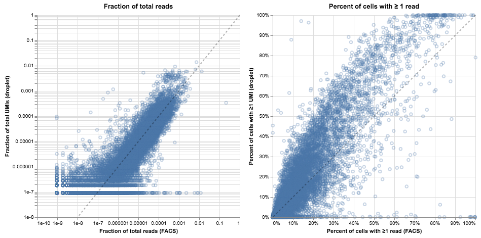
It’s tempting to stare at these plots and start to draw conclusions about the relative merits of droplet- and FACS-based methods. Indeed, we did so in the initial draft, but interpretation proved difficult. On the left, it seems like the gene levels are mostly in agreement (spread around the $y = x$ line) but there are many exceptions, with genes present at the 1% level in FACS that are entirely absent in droplets. On the right, the bulk of the genes are slightly above the diagonal (present in a larger fraction of cells in droplets than in FACS), but many genes are on the x-axis. That means they were almost never observed in the droplet data but often seen in the FACS data. Confusingly, in other cell types the majority of genes are below the diagonal, indicating they are more often found in the FACS data.
It seems likely that differences in methodology are confounding our attempt to compare methods. To illustrate that point, we’ll switch around the axes for these plots, and for each method we’ll plot the per-gene fraction of total reads versus the percent of cells with ≥1 read.
# reusable plotting function
def plot_expression_v_percent(cell_gene_reads: np.ndarray, *, title: str, **kwargs):
    cell_gene_nonzero = (cell_gene_reads.sum(0) > 0)
    x = cell_gene_reads[:, cell_gene_nonzero].sum(0) / cell_gene_reads.sum()
    y = (cell_gene_reads[:, cell_gene_nonzero] > 0).sum(0) / cell_gene_reads.shape[0]

    return (
        alt.Chart(pd.DataFrame({"x": x, "y": y}), title=title)
        .mark_point(opacity=0.1)
        .encode(
            alt.X(
                "x",
                type="quantitative",
                scale=alt.Scale(
                    type="log", domain=kwargs.get("x_domain", alt.Undefined)
                ),
                axis=alt.Axis(title="Fraction of total reads"),
            ),
            alt.Y(
                "y",
                type="quantitative",
                scale=alt.Scale(
                    type="log", domain=kwargs.get("y_domain", alt.Undefined)
                ),
                axis=alt.Axis(title="Percent of cells with ≥1 read"),
            ),
        )
    )


alt.hconcat(
    plot_expression_v_percent(droplet_thymus.X, title="Droplet data"),
    plot_expression_v_percent(facs_thymus.X, title="FACS data"),
)
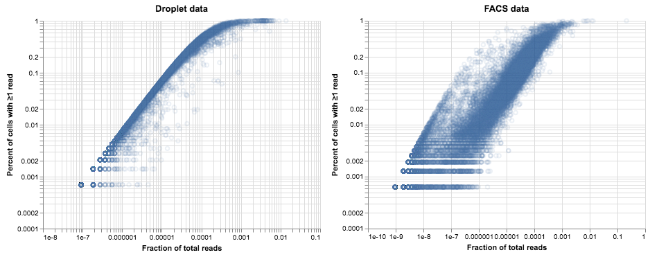
The difference between these plots is pretty striking. In the droplet data on the left, the relationship between expression and dropout looks like something we can model: genes that are highly expressed are more likely to be observed in every cell, while low-expression genes are seen less often. This relationship is what we would expect from a Poisson distribution, with a little additional noise due to variation in library depth and gene expression. If we model these sources of variation as a gamma distribution then the resulting model for observed counts is a negative binomial. Deviations from that model are a sign of heterogeneity in gene expression—perhaps indicating a mixture of cell types or cell states. This suggests a method for finding variable genes; Tallulah Andrews and Martin Hemberg describe such a method in their paper on bioR$\chi$iv.
The second plot is more confusing. The same trend is apparent but the points are much more spread out and cloudier compared to the data from droplets. We see a faint echo of the droplet curve on the left side of the plot, but most of the points are further to the right. If we assumed a negative binomial for these data we would identify a huge number of genes as variable, but we know this population of cells is relatively homogenous (probably as homogenous as the cells in the droplet data).
There must be an additional source of noise, and the obvious suspect is the PCR amplification during library preparation. The droplet data has unique molecular identifiers (UMIs) that removed this noise, while the FACS data does not, and the result is what we see. One way to test this idea is to model how we think the data are generated and see if we can reproduce these trends.
What are we measuring? scRNA-seq as a sampling process
We’re going to build a generative model of our data, in the hope that we can then understand what’s going on in the real data. We’ll criminally over-simplify the amount of labwork involved by summarizing single-cell RNA-seq into the following steps:

- Cells are isolated into wells or droplets.
- They are lysed, and individual mRNA molecules are biochemically captured and reverse-transcribed to cDNA. In the droplet method, this is where UMIs are introduced.
- The cDNA is PCR amplified, fragmented, and amplified again as part of library preparation.
- The amplified library is sequenced, demultiplexed, aligned, etc.
We can think of each of the bolded portions as a sampling step. In step 1, the cells are sampled from a population that contains an unknown amount of diversity, and our collection methods may have different biases at this step. In step 2, individual mRNA molecules are captured with some efficiency that is dependent on the biochemical method and potentially the cell state or even the gene sequence itself. Step 3 can be broken down into many different sampling steps, one for each round of PCR, as individual molecules are amplified at different rates of efficiency.
All of these sampling steps are important to think about for experimental design and interpretation. Here we are going to keep steps 1, 2, and 4 constant, by assuming a homogenous cell population, unbiased random capture, and unbiased sequencing: we will only examine the effect of step 3. Specifically: how does a potentially-biased PCR process affect the final gene count? We’ll start by simulating some data.
- We have 20,000 genes and 2,000 cells.
- Genes are expressed according to a log-gamma distribution.
- Formally: $g_i \sim e^{\Gamma(k=4,\ \theta=1)}$ where $k, \theta$ were chosen by eye to mimic realistic data.
- There isn’t a strong basis for this distribution except that log-normal looked to be skewed a bit high.
- Every cell has the same expression state.
- We sample 5,500 UMIs from every cell using a multinomial distribution.
- Technically the multivariate hypergeometric is the right distribution here, but it is difficult to implement efficiently and the multinomial has almost identical behavior at this scale.
n_genes = 20000
n_cells = 2000
n_umis = 5500 * np.ones(shape=n_cells)

# log-gamma distribution of gene expression
gene_levels = np.exp(np.random.gamma(4, 1, size=n_genes))

# every cell has the same expression distribution
cell_gene_levels = gene_levels[None,:] * np.ones((n_cells, 1))

# per-cell proportions for each gene, for sampling
gene_p = cell_gene_levels / cell_gene_levels.sum(1)[:, None]

# gene capture: for each cell, select n_reads out of the gene pool as a multinomial process
cell_gene_umis = np.vstack(
    [np.random.multinomial(n_umis[i], gene_p[i,:]) for i in range(n_cells)]
)

plot_expression_v_percent(cell_gene_umis, title="Basic model")
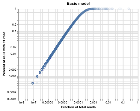
The plot above looks very similar to our droplet data, but it’s much cleaner1. There are two reasons for that: one is that we simulated identical cells, and the second is that we simulated identical library sizes. We can vary each of these assumptions in turn and see what happens to our data.
cs = []
# increasing noise levels
for s in np.linspace(0, 4.5, 4):
    # log-normal noise for the number of reads (with a lower bound to represent minimum depth)
    noisy_library = np.exp(
        st.truncnorm.rvs(-1, 2, loc=8.5, scale=s, size=n_cells)
    ).astype(int)

    # gene capture: select a random n_reads out of the gene pool for each cell
    noisy_library_umis = np.vstack(
        [np.random.multinomial(noisy_library[i], gene_p[i,:]) for i in range(n_cells)]
    )

    # add log-normal noise to the gene expression of individual cells
    noisy_genes = gene_levels[None,:] * np.exp(
        np.random.normal(loc=0, scale=s, size=(n_cells, n_genes))
    )
    noisy_gene_p = noisy_genes / noisy_genes.sum(1)[:, None]

    noisy_gene_umis = np.vstack(
        [np.random.multinomial(n_umis[i], noisy_gene_p[i,:]) for i in range(n_cells)]
    )

    cs.append(
        alt.vconcat(
            plot_expression_v_percent(
                noisy_library_umis,
                title=f"Library Noise: {s}",
                x_domain=(1e-9, 1),
                y_domain=(1e-4, 1),
            ).properties(width=200, height=200),
            plot_expression_v_percent(
                noisy_gene_umis,
                title=f"Expression Noise: {s}",
                x_domain=(1e-9, 1),
                y_domain=(1e-4, 1),
            ).properties(width=200, height=200),
        )
    )

alt.hconcat(*cs)
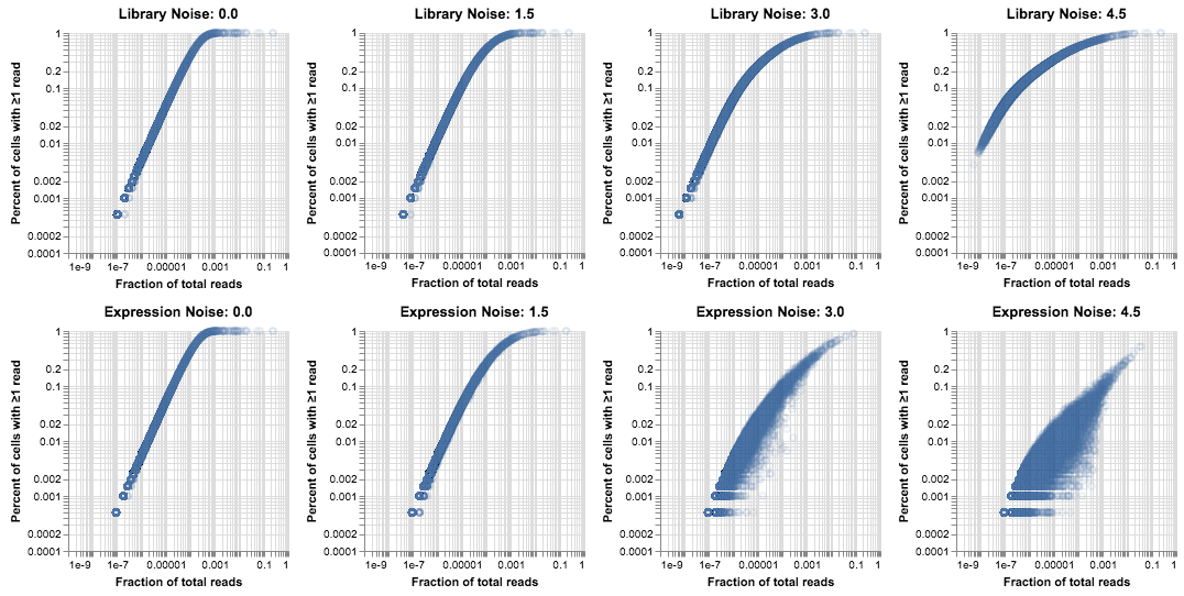
These plots are useful for gaining an intuition about how noise in the generative process affects the data. There is a clear difference between these two effects: noise in the size of the library makes the Poisson-derived curve slightly “fuzzier”, but it also raises the bottom end of the distribution because the cells with high coverage are able to recover rare genes. Noise in the gene expression lowers the top line and spreads out the distribution, because genes are less evenly distributed and so they are found in fewer cells than would be expected based on average expression. In reality we tend to see a combination of these two effects. For this post we’ll just eyeball some parameters that look like the droplet data.
noisy_library = np.exp(
    st.truncnorm.rvs(-1, 2, loc=8.5, scale=1.5, size=n_cells)
).astype(int)

# add log-normal noise to the gene expression of individual cells
noisy_genes = gene_levels[None,:] * np.exp(
    np.random.normal(loc=0, scale=1.5, size=(n_cells, n_genes))
)

noisy_gene_p = noisy_genes / noisy_genes.sum(1)[:, None]

noisy_umis = np.vstack(
    [
        np.random.multinomial(noisy_library[i], noisy_gene_p[i, :])
        for i in range(n_cells)
    ]
)

plot_expression_v_percent(noisy_umis, title=f"Library, Expression Noise: 1.5")
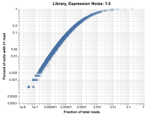
This plot doesn’t look exactly like the thymus data, but our model is still pretty simple in comparison to real tissue. In particular, we are explicitly simulating a single population, while the real data contains at least three cell types and possibly more that we don’t have the resolution to identify.
Simulating PCR
Our hypothesis is that PCR amplification bias can explain the difference between the droplet and FACS plots we saw earlier. PCR amplifies the observed level of each gene, throwing off our estimation of the expected dropout rate. Furthermore, each gene goes through PCR with a different level of efficiency, which adds noise to the measured gene counts.
Let’s build a model for this process. We can use a beta distribution to generate different levels of PCR efficiency for each gene. Then we represent the PCR amplification as a series of probabilistic doublings, with each gene increasing in abundance according to the number of existing copies and its PCR efficiency rate. If $PCR_{i}(j)$ is the number of reads for gene $i$ after PCR round $j$, and gene $i$ has a PCR efficiency $b_i \sim \beta$, then
# PCR noise model: every fragment has an affinity for PCR, and every round we do a ~binomial doubling
def pcr_noise(read_counts: np.ndarray, pcr_betas: np.ndarray, n: int):
    read_counts = read_counts.copy()
    # for each round of pcr, each gene increases according to its affinity factor
    for i in range(n):
        read_counts += np.random.binomial(
            read_counts, pcr_betas[None, :], size=read_counts.shape
        )

    return read_counts

def plot_pcr_betas(pcr_betas: np.ndarray):
    return (
        alt.Chart(pd.DataFrame({"x": pcr_betas}), title="PCR Efficiency")
        .mark_bar()
        .encode(alt.X("x:Q", bin=True), y="count(*):Q")
    )


# gene pcr: each read has a particular affinity for PCR
pcr_betas = np.random.beta(6, 5, size=n_genes)

# thirteen rounds of PCR, as described in the methods
noisy_reads = pcr_noise(noisy_umis, pcr_betas, n=13)

alt.hconcat(
    plot_pcr_betas(pcr_betas),
    plot_expression_v_percent(noisy_reads, title="UMIs + PCR"),
    plot_expression_v_percent(facs_thymus.X, title="FACS data"),
)
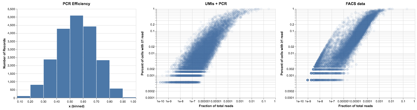
This is getting closer to the FACS plot above—using a distribution of PCR efficiencies causes the read data to spread across a few orders of magnitude. As we go through 13 rounds of PCR the high efficiency genes shift to the right while the lower ones lag behind. The right edge of the curve is fairly sharp, as nothing can replicate more efficiently than once per round.
There is one piece missing from this plot, however, which is the “shadow” of the UMI curve that we could see on the left side. Our intuition from the model so far is that these points are not being amplified very much at all. One way to get more low-efficiency genes would be to use a wider beta distribution (with more density near zero), but it actually looks like there is a small subpopulation with very low efficiency that is separate from the rest. We can model this with a mixture of two beta distributions, although it’s unclear why that should be the case. Those of you with more experience troubleshooting PCR can tell us if this seems like a reasonable distribution of efficiency across different DNA sequences.
# a bimodal distribution for PCR efficiency: most fragments around 0.5-0.6 but with a spike near 0
pcr_betas = np.vstack(
    (np.random.beta(1, 20, size=n_genes), np.random.beta(6, 5, size=n_genes))
)[(np.random.random(size=n_genes) > 0.1).astype(int), np.arange(n_genes)]

noisy_reads = pcr_noise(noisy_umis, pcr_betas, n=13)

alt.hconcat(
    plot_pcr_betas(pcr_betas),
    plot_expression_v_percent(noisy_reads, title="Reads from bimodal PCR"),
    plot_expression_v_percent(facs_thymus.X, title="FACS data"),
)
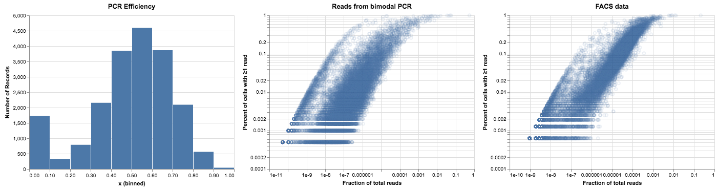
This looks pretty good, but when we compare it to our data it’s still not quite right. The bimodal distribution gave us a subpopulation of points on the left side of the plot, but it didn’t give us the relationship between expression and PCR efficiency that we can see in the FACS data. We could reproduce that relationship in a hacky way, by setting a random subset of low-expression genes to have low PCR efficiency. But that wouldn’t be very satisfying—there’s no reason that the PCR reaction should care about the expression level of the genes.
However, there’s another factor that we haven’t considered yet. When we do scRNA-seq we aren’t sequencing complete gene transcripts, we’re sequencing fragments. The number of distinct fragments we see from a gene will depend on its expression level, because a highly-expressed gene will be sampled more often. A single fragment might be all that we capture from a gene with low expression. If that fragment has poor PCR efficiency, that gene would remain on the UMI curve, part of the “shadow” that we expect. We can try this out by changing our model to work on gene fragments rather than genes. We add a step at the beginning, generating a random number of fragments for each gene (Poisson distributed) and assigning each fragment its own PCR efficiency. We’ll show the results of both the UMI distribution and the PCR-amplified version.
# random number of possible fragments per gene, poisson distributed
# add one to ensure ≥1 fragment per gene
fragments_per_gene = 1 + np.random.poisson(1, size=n_genes)
fragment_i = np.repeat(np.arange(n_genes), fragments_per_gene) # index for fragments
n_fragments = fragments_per_gene.sum() # total number of fragments

# each fragment is at the level of the gene it comes from
noisy_fragments = np.repeat(noisy_genes, fragments_per_gene, axis=1)
noisy_fragment_p = noisy_fragments / noisy_fragments.sum(1)[:, None]

# randomly sample fragments, rather than genes, according the per-cell library size
fragment_umis = np.vstack(
    [
        np.random.multinomial(noisy_library[i], noisy_fragment_p[i, :])
        for i in range(n_cells)
    ]
)

# sum up all the fragment reads for a gene to get per-gene UMI counts
gene_umis = np.hstack(
    [fragment_umis[:, fragment_i == i].sum(1)[:, None] for i in range(n_genes)]
)

# generate a per-fragment PCR efficiency
pcr_betas = np.vstack(
    (np.random.beta(1, 20, size=n_fragments), np.random.beta(6, 5, size=n_fragments))
)[(np.random.random(size=n_fragments) > 0.1).astype(int), np.arange(n_fragments)]

# amplify the fragments with PCR
fragment_reads = pcr_noise(fragment_umis, pcr_betas, n=13)

# sum up all the fragment reads to get per-gene read counts
gene_reads = np.hstack(
    [fragment_reads[:, fragment_i == i].sum(1)[:, None] for i in range(n_genes)]
)

alt.hconcat(
    plot_expression_v_percent(gene_umis, title="UMIs from gene fragments"),
    plot_expression_v_percent(gene_reads, title="Reads from gene fragments"),
    plot_expression_v_percent(facs_thymus.X, title="FACS data"),
)
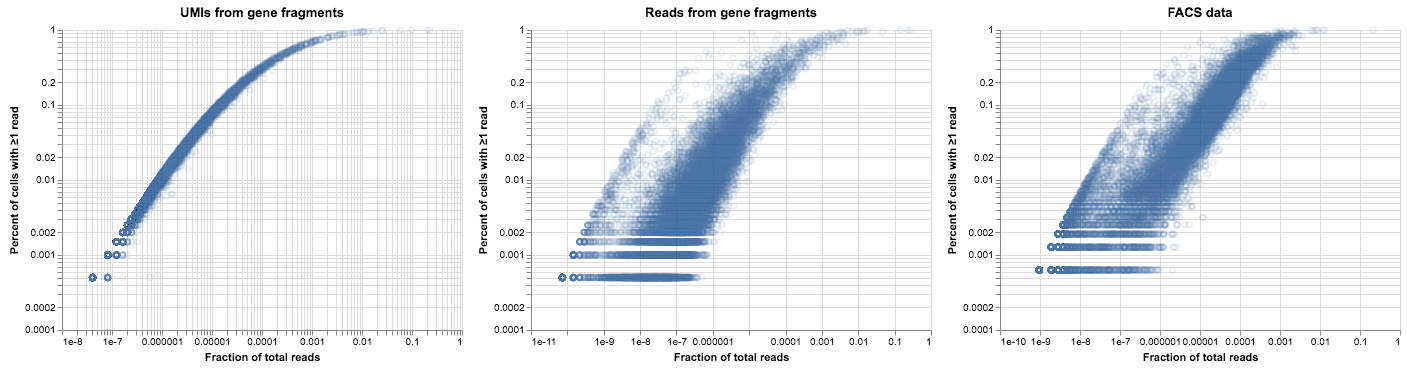
Now that’s more like it! We have most of the characteristics of the plot we generated from real data, up to some biological noise and parameter tweaks. The addition of gene fragments didn’t change how our model behaves on UMI data, but it allowed us to reproduce the “shadow” of the UMI curve for low-expression genes.
To close the loop on this post, we’ll look at what our droplet data would be if we didn’t collapse reads via the UMIs. To do this, we needed to parse the BAM file that is output by CellRanger. For those following along at home, be warned that it takes a long time to read through the entire BAM file.
# we'll need the pysam library to read the bam file
import pysam

# dictionaries that let us index into the read matrix by barcode and gene
bc_i = {
    bc: i
    for i, bc in enumerate(
        droplet_thymus.obs.index.map(lambda v: v.rsplit("_")[-1] + "-1")
    )

}
g_i = {g:i for i,g in enumerate(droplet_thymus.var.index)}

# our matrix of values
read_matrix = np.zeros_like(droplet_thymus.X)
# as a sanity check, we'll show that we can reconstruct the UMI data
umi_matrix = np.zeros_like(droplet_thymus.X)

bam_file = pysam.AlignmentFile("10X_P7_11_possorted_genome_bam.bam", mode="rb")
for a in bam_file:
    if (a.mapq == 255                                    # high quality mapping
        and a.has_tag("CB") and a.get_tag("CB") in bc_i  # in our set of barcodes,
        and a.has_tag("GN") and a.get_tag("GN") in g_i   # that maps to a single gene,
        and a.has_tag("RE") and a.get_tag("RE") == "E"   # specifically to an exon,
        and a.has_tag("UB")):                            # and has a good UMI

        # then we add it to the count matrix
        read_matrix[bc_i[a.get_tag("CB")], g_i[a.get_tag("GN")]] += 1
        # if this isn't marked a duplicate, count it as a UMI
        if not a.is_duplicate:
            umi_matrix[bc_i[a.get_tag("CB")], g_i[a.get_tag("GN")]] += 1

# umi data is identical to what we had before
assert np.array_equal(umi_matrix, droplet_thymus.X)

# cells have all the same genes, just the counts are different
assert np.array_equal((read_matrix > 0), (droplet_thymus.X > 0))

alt.hconcat(
    plot_expression_v_percent(droplet_thymus.X, title="Droplet data"),
    plot_expression_v_percent(read_matrix, title="Droplet data without using UMIs")
)
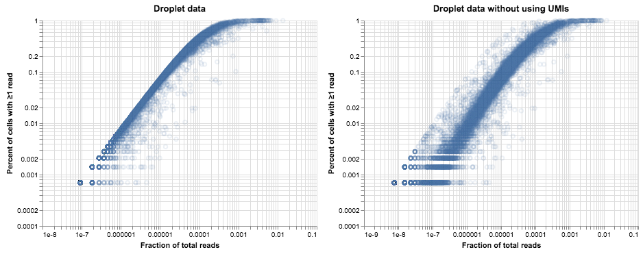
Without using UMIs to deduplicate the read data, we see a very similar story to the plot of FACS data up above, consistent with our model of how PCR bias can add noise to read counts. Of note, the cloud of amplified reads is not shifted so far to the right as it was in the plot of FACS data. While both protocols have about the same number of PCR cycles, it appears that the efficiency of PCR in the 10X library is somewhat lower overall: 20-30x amplification rather than the >100x amplification in the FACS data. Those numbers suggest that PCR is somewhere around 30% efficient in the 10X library and 50-60% efficient in the Smart-Seq2 protocol. However, the analysis above shows that higher efficiency is not necessarily desirable—variation in efficiency leads to a lot of noise in gene counts, and in the absence of UMIs this can make analysis more challenging. When UMIs are present, higher amplification will just reduce the effective depth of the library.
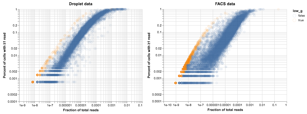
Now that we have an equivalent plot for the droplet data, we can identify genes on the low-efficiency line in both datasets and see if there’s any overlap.
def low_efficiency_genes(cell_gene_reads: np.ndarray):
    x = cell_gene_reads.sum(0) / cell_gene_reads.sum()
    y = (cell_gene_reads > 0).sum(0) / cell_gene_reads.shape[0]

    # bin values by y on a log scale
    idx = np.digitize(y, 10**np.linspace(-4, 0, 21))

    low_g = np.zeros(cell_gene_reads.shape[1], dtype=bool)
    for i in np.unique(idx):
        low_g[idx == i] = (x[idx == i] < np.min(x[idx == i]) * 2)

    return low_g

def plot_low_efficiency_genes(
    cell_gene_reads: np.ndarray, low_g: np.ndarray, title: str
):
    nz = (cell_gene_reads.sum(0) > 0)
    x = cell_gene_reads.sum(0) / cell_gene_reads.sum()
    y = (cell_gene_reads > 0).sum(0) / cell_gene_reads.shape[0]

    return (
        alt.Chart(
            pd.DataFrame({"x": x[nz], "y": y[nz], "low_g": low_g[nz]}), title=title
        )
        .mark_point(opacity=0.1)
        .encode(
            alt.X(
                "x",
                type="quantitative",
                scale=alt.Scale(type="log"),
                axis=alt.Axis(title="Fraction of total reads"),
            ),
            alt.Y(
                "y",
                type="quantitative",
                scale=alt.Scale(type="log"),
                axis=alt.Axis(title="Percent of cells with ≥1 read"),
            ),
            color="low_g",
        )
    )


droplet_low_g = low_efficiency_genes(read_matrix)
facs_low_g = low_efficiency_genes(facs_thymus.X)

alt.hconcat(
    plot_low_efficiency_genes(read_matrix, droplet_low_g, title="Droplet data"),
    plot_low_efficiency_genes(facs_thymus.X, facs_low_g, title="FACS data"),
)
# this won't actually print a nice markdown table but it's a start
n_genes = facs_low_g.shape[0]
low_in_facs = facs_low_g.sum()
low_in_droplets = droplet_low_g.sum()
intersection = (facs_low_g & droplet_low_g).sum()
hypergeom_p = st.hypergeom.sf(intersection, n_genes, low_in_facs, low_in_droplets)

print("\t".join(f"{c:>19}" for c in ("n_genes", "low in FACS", "low in droplets",
                                     "intersection", "hypergeometric test")))
print("\t".join(f"{c:>19}" for c in (n_genes, low_in_facs, low_in_droplets,
                                     intersection, f"""{hypergeom_p:.3g}""")))
| n_genes | low in FACS | low in droplets | intersection | hypergeometric test |
|---|---|---|---|---|
| 23433 | 3036 | 629 | 158 | 2.01e-17 |
While there appears to be significant overlap between the two sets, I wouldn’t say that we have identified a consistent set of under-amplified genes. Analysis of more tissues and cell types might clarify matters.
Conclusions
In the end we’ve built a relatively simple model of PCR and sampling, and it produces data that look qualitatively like the data we really observed. One open question is whether the distribution of PCR efficiencies is realistic. A bimodal distribution might reflect that some proportion of cDNA sequences form dimers or otherwise impede PCR, but a unimodal distribution is more intuitive. It’s possible that we’re missing yet another mechanism in this process that would naturally lead to the behavior we’re seeing.
While this blog post is mostly about trying to understand a particularly confusing plot, it was not a purely theoretical exercise. There are a few ideas that arise from this model of our data.
- UMIs are really useful. Looking at these plots and how they are affected by noise has emphasized the importance of UMIs for getting a good estimate of gene expression. By having a strong statistical model for how the data are generated, we can more easily identify genes with heterogeneous expression within a cluster. This level of detail is much more difficult to resolve when read counts are affected by amplification noise.
- Too much PCR is likely harmful. We spent a fair amount of time trying to recreate the shadow on the left side of the FACS plot, but we haven’t discussed the implications of that shadow. According to our model, those are genes that have very low PCR efficiency and may not have been amplified at all during the second PCR step. Nevertheless, we are recovering those reads from the sequencer at a rate consistent with their expression. This suggests that we might be able to optimize our protocols by doing fewer rounds of library amplification. That would allow us to improve our sequencing throughput, either by sequencing more cells at once or by sequencing the same number of cells much more deeply.
- We should be able to fill in our matrix. When we are confident that we have a homogenous cluster of cells, the plots above show us a natural method of imputing gene expression values when they are missing, even in the face of PCR noise. The proportion of cells with ≥1 read is a good predictor of the number of UMIs in each cell, and this holds true even when the reads themselves are subjected to a biased PCR process. The points in the second plot have shifted to the right but not up or down, so it’s possible the effect of amplification can be removed by fitting a curve to the top left of the graph. However, when we are not confident of a homogenous population this becomes much riskier, and it is harder to have that confidence in the face of noisy reads.
Related Work
- Tallulah Andrews and Martin Hemberg have developed a method that takes advantage of the relationship between mean expression and expected dropout to identify genes with differential expression.
- Valentine Svensson’s excellent blog contains multiple posts on the nature of scRNA-seq data. In particular this post about “dropout” and this one about the relationship between Poisson sampling and the negative binomial distribution were inspirations for our own analysis.
- Kebschull and Zador is a deep dive into the many factors that can cause noise in PCR amplification.
- Grün et al. and Islam et al. are two of many relevant papers about the noise in scRNA-seq data and finding ways to correct for it.
-
When we consider a specific gene, our sampling process is a binomial distribution $X \sim B(n, p)$ with $n$ equal to the number of reads from that cell and $p$ equal to the relative abundance of that gene in the cell. When $n$ is large and $p$ is small, a Poisson distribution is a good approximation for this process, which is why most people refer to scRNA gene counts (assuming no variation between cells) as being Poisson-distributed. Seeing a particular gene $g$ in a cell is based on the depth of the library and the gene’s relative expression, and the probability of seeing $k$ reads is given by:
When we are counting the prevalence of missing genes, this simplifies to $ P_g(k=0) = e^{-\lambda}$. The plot above is the complement, $ P_g(k>0) = 1 - e^{-\lambda}$. ↩